

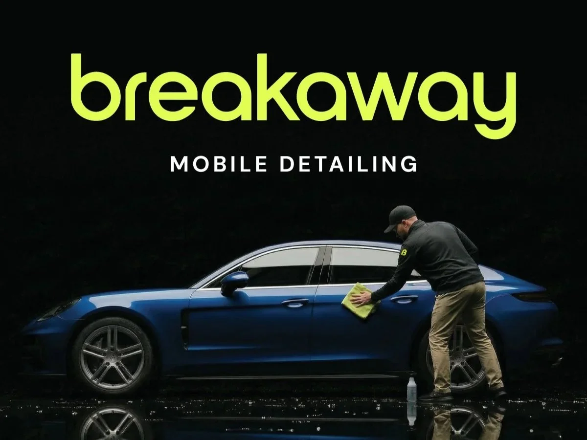
Project Showcase: Building a Brand From the Ground Up for Breakaway Mobile Detailing
THE CHALLENGE:
Generic names, DIY logos, and price-driven competition make it difficult for a new business to signal quality before it has a track record to point to.
The owner was building something different. A former professional cyclist with exacting standards, he was targeting clients with high-end vehicles who expect a level of care most mobile detailers don't deliver. But he was starting from nothing, with no name, no identity, and no digital presence.
The challenge was establishing credibility from day one, in a market where customers have no easy way to tell a premium operator from an average one.
THE PARTNERSHIP:
Jefferey reached out to Edit Your Brand asking for our help.
He wasn't looking for a logo and a website template. He was starting a business and wanted the brand built right before he opened for work.
We took on all of it. Naming, brand identity, website design and development, and sales materials. Jefferey trusted the process and gave us room to build something that wouldn't look like everyone else's, and that trust shaped every decision that followed.
THE PLAN:
The name came from the owner's own story. In competitive cycling, a breakaway is the moment a rider separates from the pack and surges ahead. It captured exactly what he was building, and it gave the business something most startups never get: a name rooted in a real story rather than an available domain. That authenticity became the foundation everything else was built on.
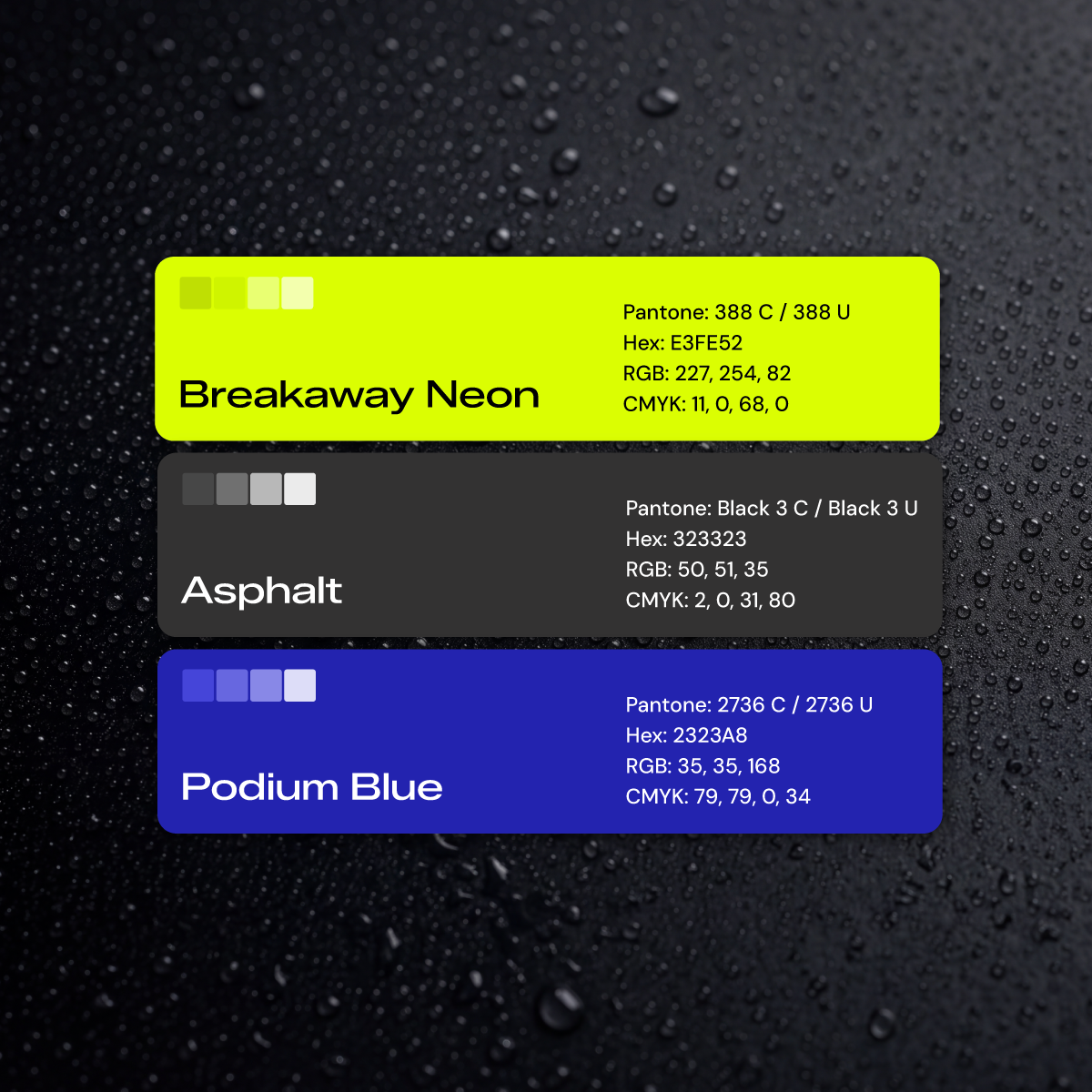
The identity was built to command attention. Bold typography and a sharp, high-energy visual language that reflects the owner's own intensity, designed to make clear at a glance that this isn't an average mobile detailer. In a category that defaults to safe, standing out is the strategy.
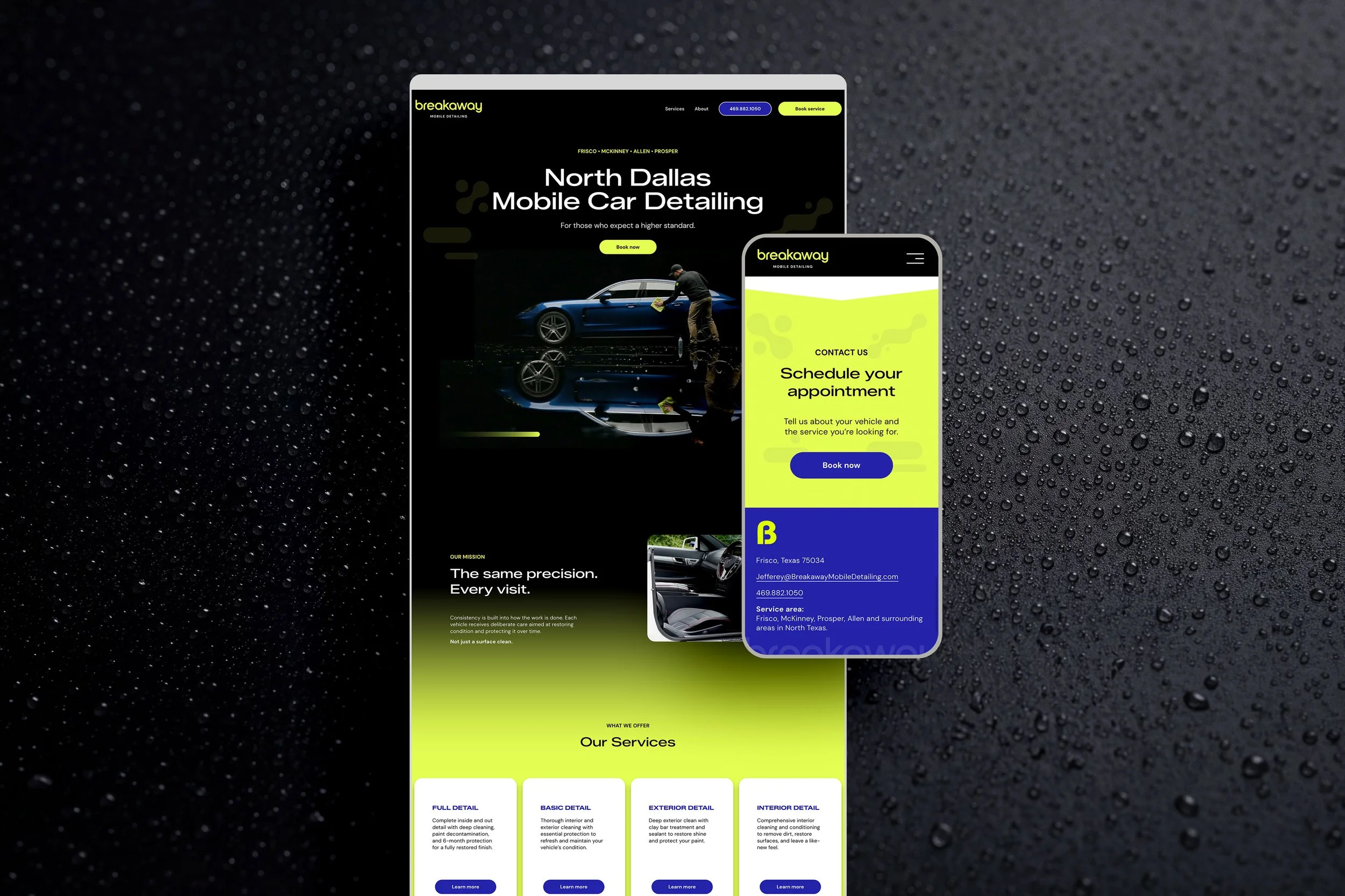
The website was built around two goals: credibility and conversion. Knowing his clientele arrives with high standards and expensive vehicles, we designed a site that communicates expertise from the first click. Messaging, layout, and booking flow were built to move a visitor from impressed to booked without friction.
Sales materials extended the brand offline, giving him professional collateral to present alongside a business that is still new.
THE RESULT:
Breakaway opened with a premium look and feel that resonates with the clients Jefferey set out to reach, the kind of owners who are extremely particular about their vehicles.
Bookings are strong and the Google reviews continue to roll in. The branding and website bring the right clients in, and Jefferey wows them with his service and attention to detail.
THE OUTCOME:
A name, brand identity, and online presence that give Breakaway Mobile Detailing credibility and the premium customer experience.
VISIT WEBSITE
CLIENT PERSPECTIVE
“I was expecting the branding and website process to feel overwhelming, but Edit Your Brand made it incredibly easy. They took the time to understand my story, my business and where I wanted to go, and created a brand that feels like me while positioning Breakaway for growth.”
— Jefferey May, Breakaway Mobile Detailing
PROJECT TYPE
Company Naming, Brand Identity and Website Design
SERVICES PROVIDED
Company Naming
Brand Identity
Logo Suite
Brand Guidelines
Website Design
Sales Collateral
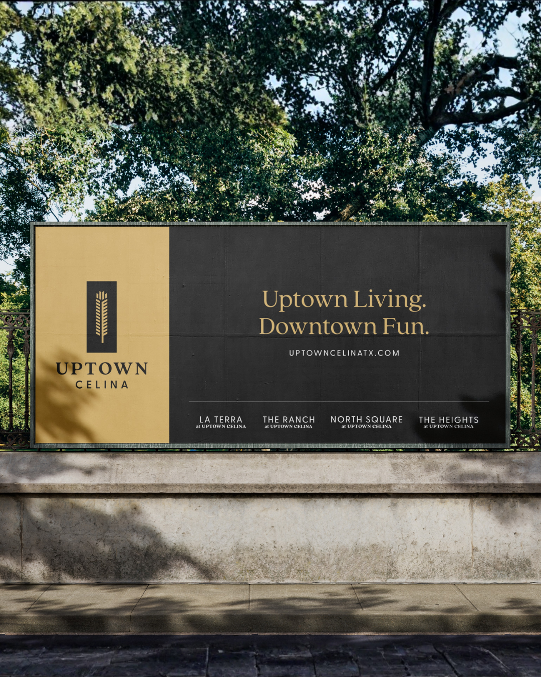
Project Showcase: Creating a Master-Planned Community Brand for Uptown Celina
THE CHALLENGE:
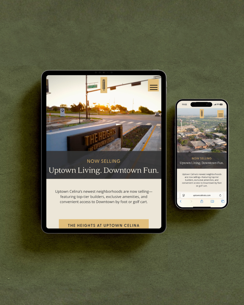
When Rockhill Capital & Investments began developing Uptown Celina, they weren't introducing a new neighborhood. They were creating an entirely new district adjacent to Historic Downtown Celina, one that would eventually include four distinct communities united under a single vision.
Before construction was complete, the project needed an identity that could generate excitement, establish credibility, and give future residents a sense of place. The challenge was creating a brand that felt connected to Celina's character while standing confidently on its own, all while building a flexible system that could grow alongside the development for years to come.
THE PARTNERSHIP:
Edit Your Brand partnered with Rockhill Capital & Investments to create the strategic foundation for Uptown Celina's launch.
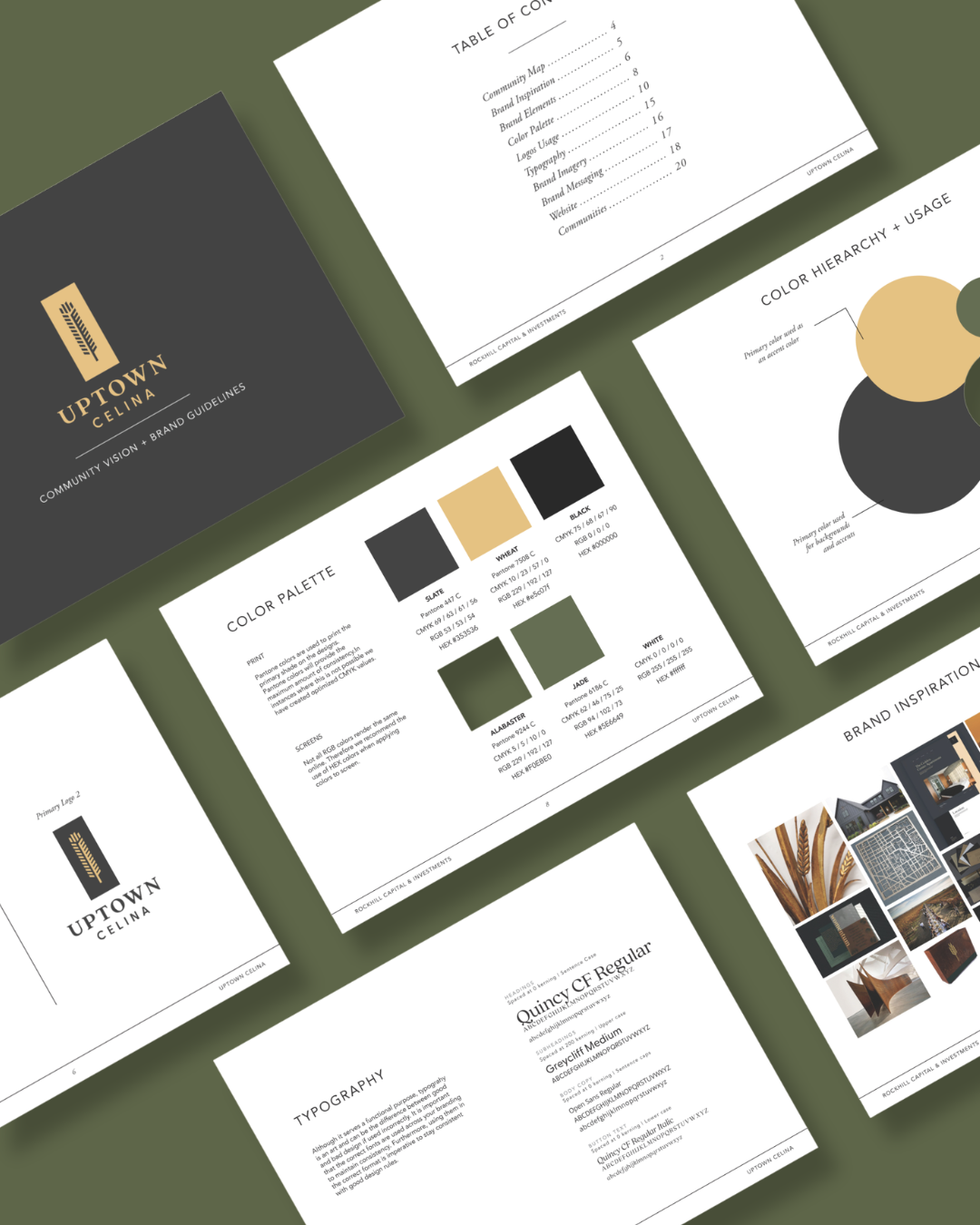
From the beginning, our role extended beyond designing a logo. We worked alongside the development team to create a comprehensive identity system that would guide how Uptown Celina was introduced to the market and experienced across every stage of the project.
Together, we developed a brand that could unify the overall development while giving each of its four neighborhoods a distinct identity within the larger family of brands.
THE PLAN:
Our work began with developing a strategic brand identity rooted in Uptown Celina's location and long-term vision.
Drawing inspiration from Historic Downtown Celina, we created a modern identity system designed to feel authentic to its surroundings while appealing to today's homebuyers. From there, we extended the brand across every major customer touchpoint to create a cohesive experience from the first introduction through community launch.
THE RESULT:
What began as a vision on paper became a recognizable destination with an identity designed to support years of growth.
Today, the Uptown Celina brand extends seamlessly across digital, print, environmental signage, and community marketing, creating a consistent experience for prospective homeowners at every stage of their journey. The identity system continues to support the development as new neighborhoods are introduced and the community grows.
Outcome: A comprehensive brand identity that transformed an unbuilt vision into a cohesive destination, providing the strategic foundation for one of North Texas' most anticipated master-planned communities.
VISIT WEBSITE
CLIENT PERSPECTIVE
“Edit Your Brand helped bring Uptown Celina to market with branding and marketing that felt aligned with the vision behind the community from day one.”
— Ryan Griffin, Rockhill Capital & Investments
PROJECT TYPE
Master-Planned Community Brand and Identity Development
SERVICES PROVIDED
Community Naming
Brand Strategy + Identity
Logo Suite
Brand Architecture
Neighborhood Brand Identity System
Brand Guidelines
Website Design
Marketing Collateral
Community Signage
Social Media
Grand Opening Marketing
Project Showcase: Building Credibility Through Consistent Social Media for Morphic Development
THE CHALLENGE:
Morphic Development is a Texas-based real estate development firm shaping communities across the region. Their work spans land planning, design and construction oversight—highly visible, high-stakes projects that demand trust from investors, municipalities and partners.
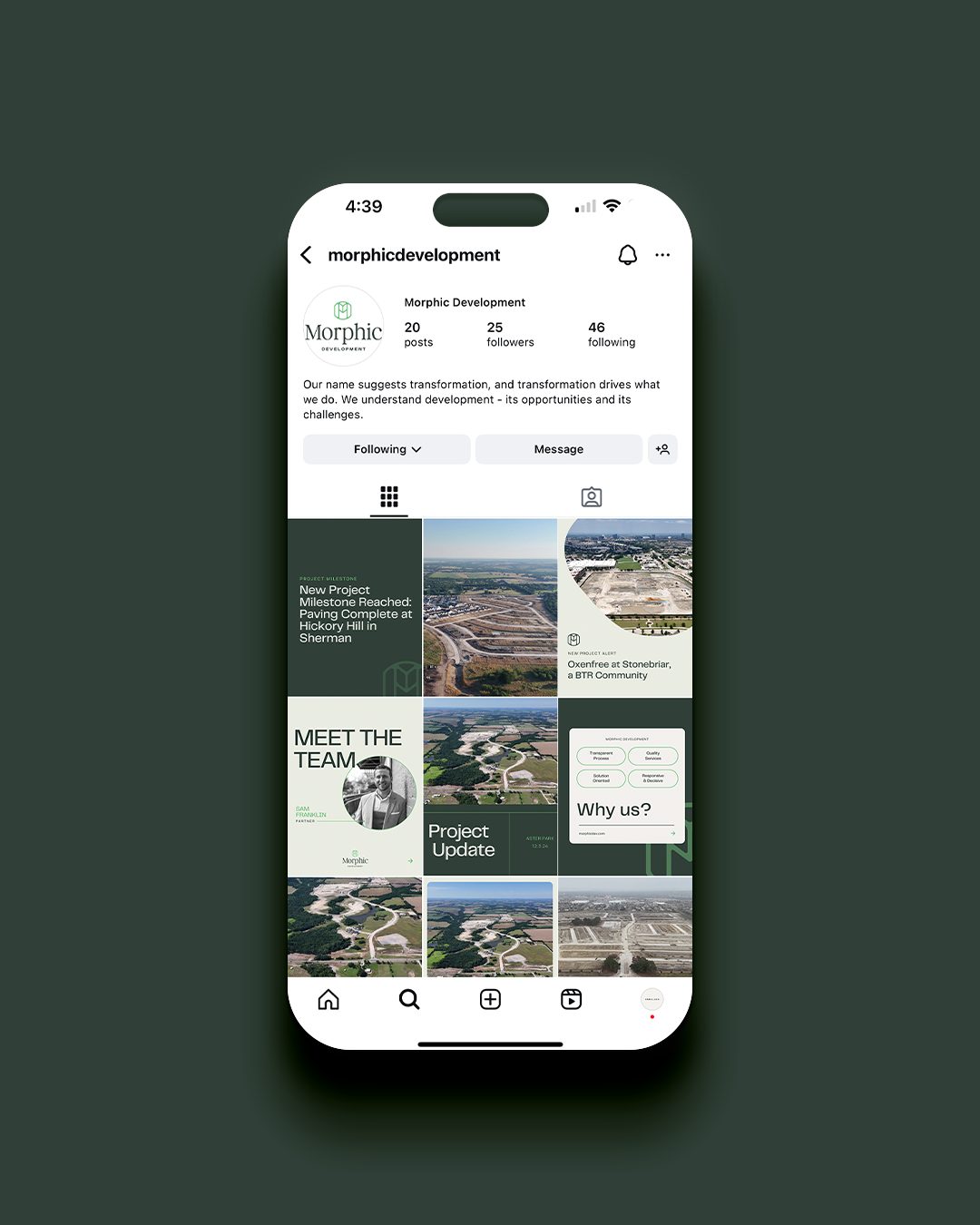
But while their projects spoke for themselves, their social media feed stayed quiet. With no internal marketing team, Morphic didn’t have the time or structure to post consistently, and that silence created a gap.
When potential partners or city officials looked them up, they found a few scattered posts, months apart with no consistent rhythm or clear reflection of the caliber of development projects they oversaw.
Morphic needed to strengthen their presence without adding work to an already full plate.
THE PARTNERSHIP:
That’s where Edit Your Brand came in.
Morphic needed a partner who could take full ownership of their social presence—building a clear, consistent, and credible foundation that reflected the sophistication of their work.
They selected our Ready-to-Post Social Media Content Package, a done-for-you content system designed for teams who want professional, branded posts handled each month while keeping scheduling in-house.
Our goal was simple: make social media effortless, effective and aligned with their brand.
THE PLAN:
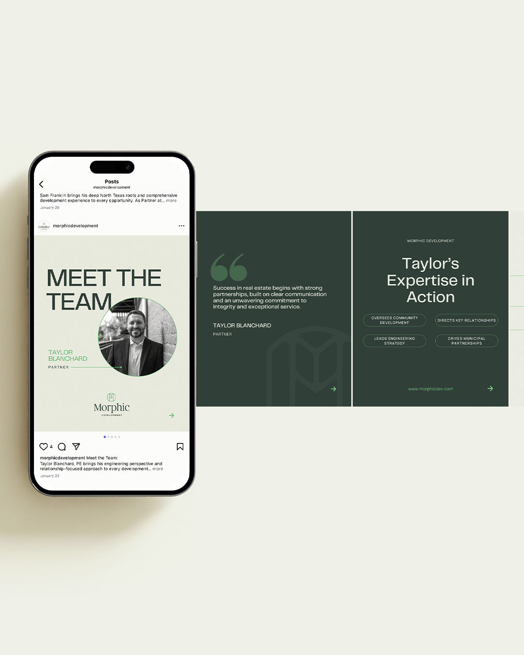
We started by defining a system Morphic could sustain long-term, with content that told the real story of their developments—clean, professional and strategic.
Our work included:
Social Media Audit
Discovery & Strategy Session
Profile Setup & Optimization
Social Media Strategy & Guidelines
Branded Template Suite
Evergreen Content Creation
Ongoing Monthly Content
Each element was designed to remove the friction of daily posting while keeping their feed active, on-brand and relevant to their audience.
THE RESULT:
In less than 90 days, Morphic’s social media presence shifted from quiet to confident. Their feed became a curated mix of brand storytelling, team highlights and project milestones, showing the steady activity and partnerships behind their developments, helping establish rapport with prospective clients well before they initiate contact.
Instead of scrambling to post, Morphic gained a system they could rely on. Their brand now shows up consistently, communicates clearly, and reflects the same level of intention they bring to every project.
Outcome: A credible, consistent social media presence that reinforces Morphic’s leadership in real estate development and builds genuine connection with stakeholders and prospective clients without draining team resources.
VISIT WEBSITE
CLIENT PERSPECTIVE
“Partnering with Edit Your Brand gave us the visibility and consistent marketing presence we needed to grow. As a small team without dedicated marketing resources, we needed someone who could just take the reins—and they did.”
— Taylor Blanchard, Morphic Development
“With their understanding of real estate and land development, they spoke our language, created content that connected with our audience, and freed us up to focus on the work only we can do. Now it feels like our social media reflects the quality of the work we’re doing.”
— Sam Franklin, Morphic Development
PROJECT TYPE
Social Media Strategy + Content
SERVICES PROVIDED
Ready-to-Post Social Media Content Package
Social Media Audit
Discovery & Strategy Session
Profile Setup & Optimization
Social Media Strategy & Guidelines
Branded Template Suite
Evergreen Content Creation
Ongoing Monthly Content
Project Showcase: Brand Identity Development for Neighborhood Management Inc.
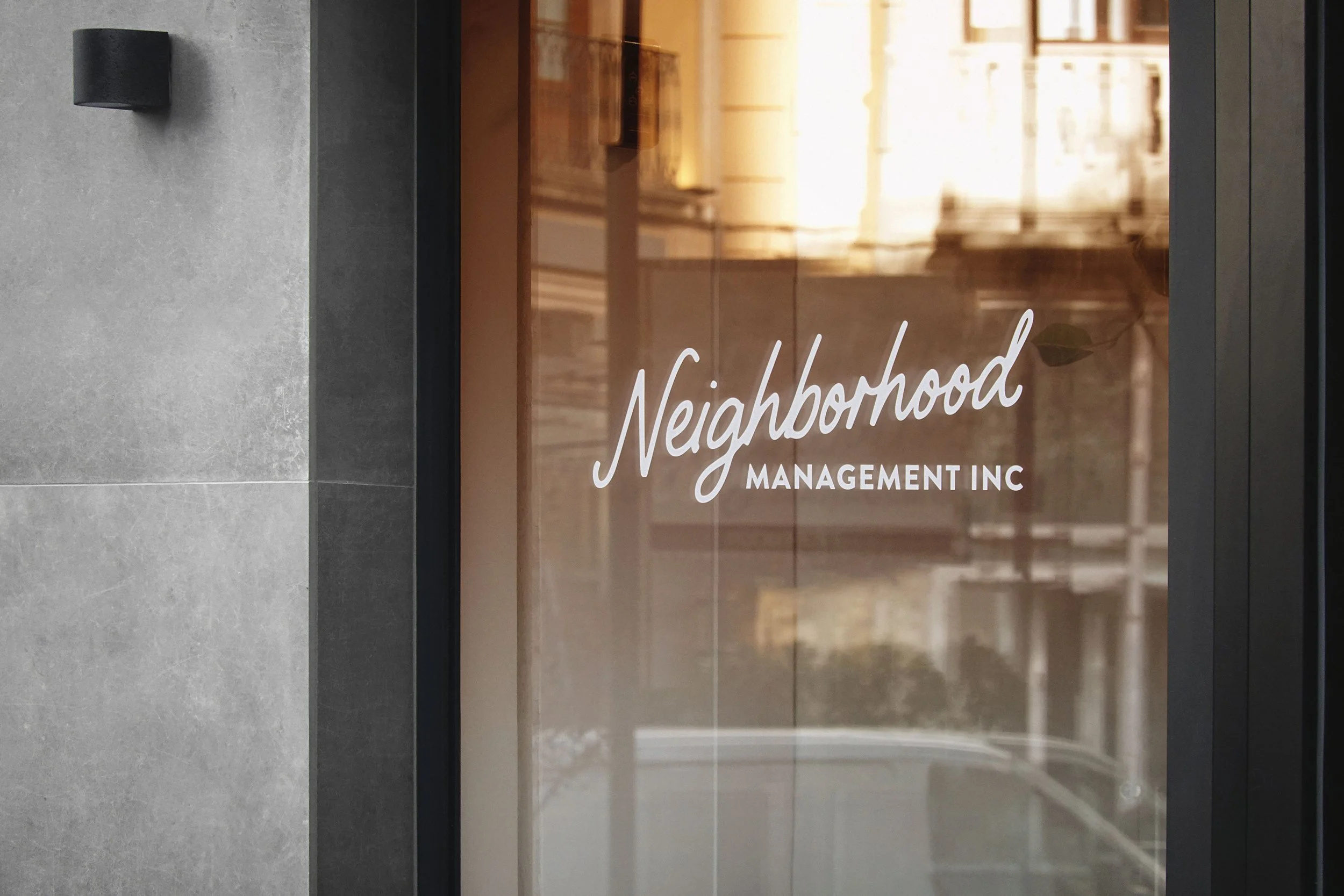
Neighborhood Management Inc. (NMI) is a full-service homeowners association management company proudly serving residential developers and homeowner-operated HOAs. Established in 1998, Neighborhood has built its reputation on delivering dependable, high-touch service with an approachable, professional mindset—while remaining independently owned and deeply committed to the communities it serves.
OBJECTIVE:
As Neighborhood continued to grow, its visual brand had evolved in pieces over time. While functional, it no longer reflected the established, experienced industry leader the company had become. The objective was to conduct a full brand audit and create a cohesive, modern brand identity that aligned with the company’s confidence, capability, and long-standing reputation.
The refreshed identity needed to resonate with long-time clients while also appealing to a younger generation of homeowners and decision-makers—many of whom value strong design, clarity, and professionalism when selecting service partners.
APPROACH:
Edit Your Brand started with research:
Competitor Research & Marketing Audit: Competitor research and a comprehensive marketing audit helped us understand Neighborhood’s current positioning, industry norms, and opportunities for differentiation.
Strategic Discovery Process: Through a strategic discovery process, we defined the emotional tone of the brand—not just how it looks, but how it feels to work with Neighborhood.
This research prepared us to launch a new brand identity that balances approachability and professionalism, reflecting Neighborhood’s experienced, do-what-it-takes attitude and its commitment to clear communication and drama-free service. A key goal was to visually express their belief in being better before bigger - confident, capable, and always improving.
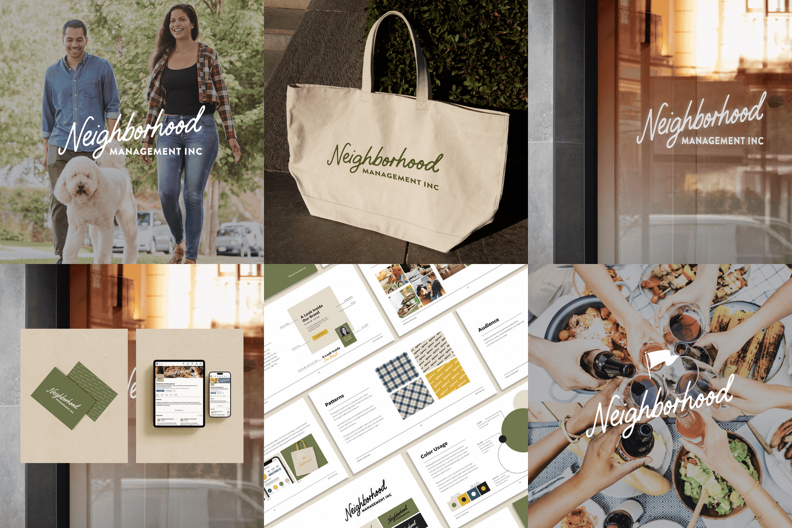
Backed by strategy, we executed a new brand identity suite, including:
A refreshed logo suite and brand mark designed to stand apart in a traditionally conservative industry
A welcoming yet polished color palette that conveys confidence, dependability, and warmth
Supporting brand patterns, typography, and imagery that reinforce consistency across platforms
A comprehensive brand style guide to ensure clarity and cohesion moving forward
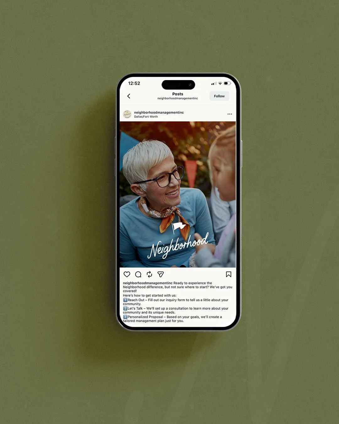
We then applied the new brand system across core touchpoints, including business cards, stationery, social media graphics, and a redesigned capabilities presentation. Key messaging within the sales deck was refined to clearly communicate Neighborhood’s value proposition to developers and HOA boards alike.
RESULT:
The final result is a confident, cohesive brand identity that reflects who Neighborhood truly is today—an experienced, trusted HOA management partner that is approachable, professional, and deeply committed to the communities they serve. The refreshed brand positions Neighborhood to remain relevant with long-standing clients while connecting more effectively with younger homeowners and boards entering their decision-making years.
This project exemplifies our expertise in helping established real estate-adjacent companies step into a brand that matches their maturity, reputation, and ambition, providing the clarity and consistency needed to support long-term growth and a stronger market presence.
CLIENT PERSPECTIVE
“We couldn't be happier with our decision to partner with Edit Your Brand for our company’s rebrand.”
— Audrey Beard, Neighborhood Management Inc.
PROJECT TYPE
Brand Identity Development
SERVICES PROVIDED
Competitor Research + Marketing Audit
Logo Suite + Brand Mark
Color Palette + Brand Pattern
Brand Imagery + Typography Selections
Brand Style Guide
Website Favicon
Business Cards
Letterhead + Notecard
Social Profile Graphics
Capabilities Presentation Redesign

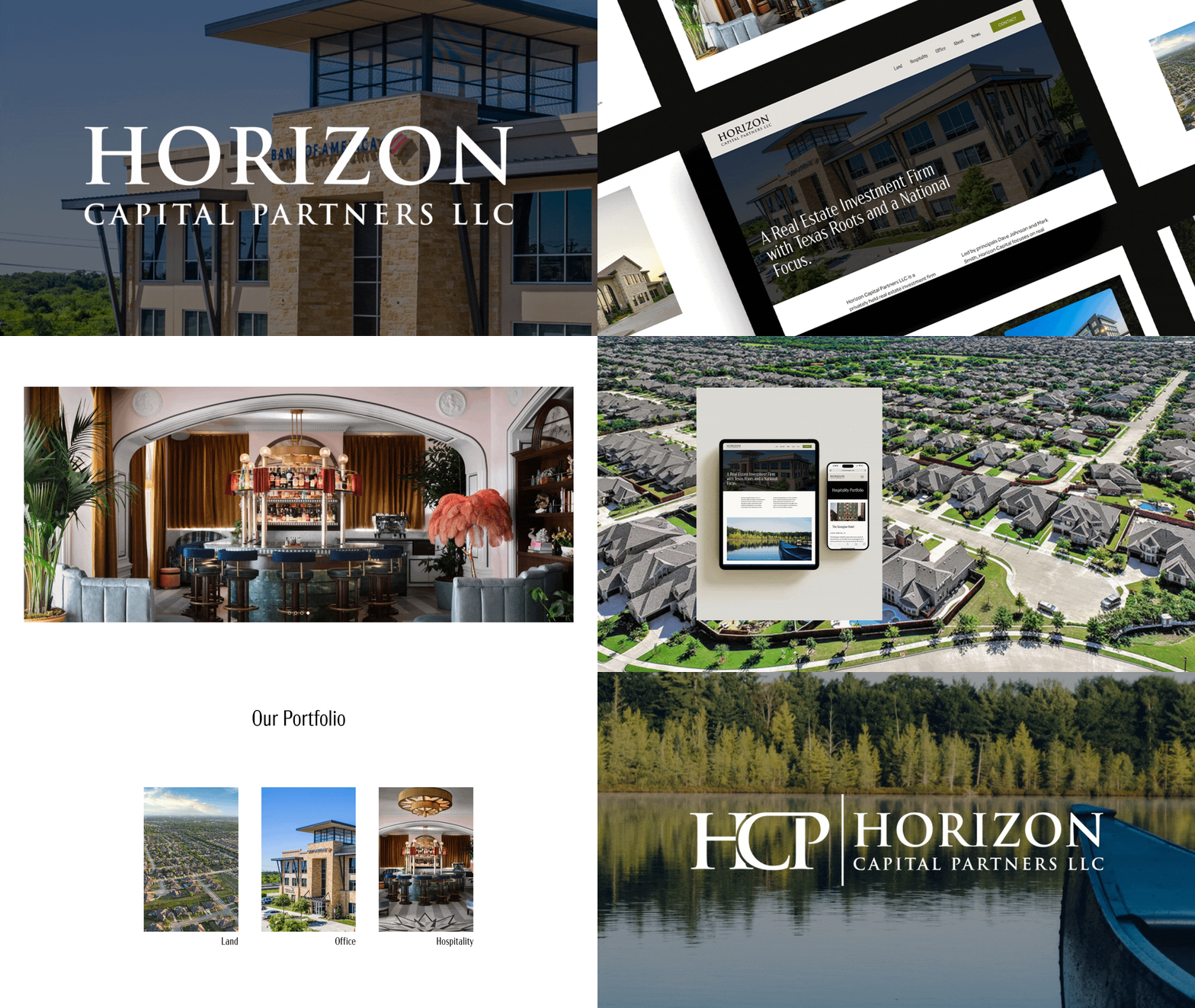
Project Showcase: New Brand Identity and Website for Real Estate Investment Firm, Horizon Capital

Horizon Capital Partners LLC is a privately held real estate investment firm creating immense value for investors through strategic partnerships with skilled land developers and a deep knowledge of the real estate market.
OBJECTIVE:
As the company evolved, Horizon Capital sought to elevate its market presence by refining its brand identity and enhancing its website. The goal was to create a sophisticated, cohesive look that reflected their expanding portfolio of projects, and effectively engaged high-value investors.
APPROACH:
Edit Your Brand delivered a tailored, phased solution:
Brand Refinement: Updated the logo, favicon, color palette, and typography to project a polished, premium image. Developed a comprehensive brand style guide for consistency.
Visual Storytelling: Curated striking project imagery to highlight the uniqueness and beauty of Horizon Capital's developments.
Enhanced Copywriting: Refined messaging to clearly communicate their value propositions and position them as industry leaders.
Website Redesign: Created a sleek, user-friendly platform to showcase projects and engage investors effectively.
RESULT:
The rebrand positioned Horizon Capital as a leader in real estate investment with:
A cohesive, sophisticated brand identity that resonates with their target audience.
An engaging, streamlined website experience that effectively highlights their portfolio.
Improved messaging and visual consistency that strengthened their market presence and appeal to investors.
This transformation earned immediate positive feedback from their peers, helped enhance their credibility and solidified Horizon Capital’s standing as a top-tier investment firm.
If you’re in the real estate industry and interested in learning more about our services, please reach out at hello@edityourbrand.com. In the meantime, follow us on LinkedIn and Instagram to get a feel for who we are, how we may be able to help you and to see our latest projects.
PROJECT TYPE
Brand + Website Project
SERVICES PROVIDED
Logo Suite
Brand Mark
Favicon
Color Palette
Brand Pattern + Texture
Brand Imagery Curation
Typography Selections
Brand Style Guide
Business Cards
Website Design + Development

Project Showcase: Creating a Unique Brand Identity for New Residential Community - Eastwell Farms - in Tioga, TX

Eastwell Farms is a new residential community located in Tioga, Texas. The development’s name and brand identity draws inspiration from the area’s natural beauty, the Native American meaning behind the town name, and most notably, its history of mineral wells and healing waters that drew people to the community.
OBJECTIVE:
We began by conducting in-depth research to fully capture the unique story of Tioga and its surroundings. This informed our creative process in several key areas:
Community Naming: We crafted a name for the community and its streets, reflecting the historical and natural themes of the area.
Visual Identity: A warm and sophisticated color palette, unique brand patterns, and curated imagery were developed to evoke the community’s rural and serene essence and create a connection with prospective buyers.
Logo Suite: We designed a versatile logo suite, including a primary logo, brand mark, and favicon. These elements ensure strong visual elements across various platforms and applications.
Typography: Selected fonts were chosen for their readability and alignment with the brand aesthetic, ensuring consistency throughout marketing materials.
Brand Style Guide: All elements were compiled into a comprehensive guide that can be easily shared with future homebuilders, to provide clear, actionable instructions for brand applications, from signage to sales collateral.
APPROACH:
We began by leading them through our brand strategy process to solidify their positioning and messaging statements. This language can be used across their presentation materials and social channels. We then embarked on brand identity development followed by website design.
RESULT:
The result is a distinct brand identity that captures the rich history and natural beauty of Tioga while embracing a Texas-inspired vibe that resonates deeply with the developer’s roots and future residents. The cohesive branding will serve as a vital tool in creating impactful signage and marketing materials, enabling a streamlined sales process as the community prepares to kick off home sales.
This project exemplifies our expertise in delivering tailored branding solutions for real estate developers, helping them cast a clear vision for a community early in the development process. In a competitive market, a well-defined community vision can gain traction and awareness over the competition, which ultimately helped homebuilders and developers to see a faster return on their investment.
If you’re a real estate developer interested in learning more about our services, please reach out at hello@edityourbrand.com. In the meantime, follow us on LinkedIn and Instagram to get a feel for who we are, how we may be able to help you and see our latest projects.

PROJECT TYPE
Naming + Brand Identity Development
SERVICES PROVIDED
Community Name Development
Street Name Development
Logo Suite
Brand Mark
Favicon
Color Palette
Brand Pattern + Texture
Brand Imagery Curation
Typography Selections
Brand Style Guide
KIND WORDS FROM THE CLIENT
“I think it’s gorgeous. I really like the fact that it looks like a Texas brand combined with the gorgeous color tones. Truly fantastic!”
— Tyler R., homebuilder

Project Showcase: New Brand Identity and Website for Real Estate Development Firm, Southridge Park

Southridge Park is a professional services consulting company specializing in all aspects of real estate acquisitions, entitlements, development, and management. They work with universities, family offices with legacy land, and real estate investors and developers.
OBJECTIVE:
The founders sought us out to design a new brand identity that showcases their unique expertise, process and approach. They also have a deep appreciation for land and nature, and wanted to illustrate their dedication to enhancing and protecting the natural environment as part of their development approach.
APPROACH:
We began by leading them through our brand strategy process to solidify their positioning and messaging statements. This language can be used across their presentation materials and social channels. We then embarked on brand identity development followed by website design.
RESULT:
The result is a brand identity that is polished and classic, yet grounded, earthy and approachable. The brand was brought to life in the newly designed website, which allows prospective clients to get a feel for the Southridge Park team, what they stand for and how they can help.
VISIT WEBSITE

PROJECT TYPE
Brand Identity + Website Design
SERVICES PROVIDED
Logo Suite
Brand Mark
Favicon
Color Palette
Brand Pattern + Texture
Brand Imagery
Typography Selections
Brand Style Guide
Business Cards
Notecard + Envelope
Website Design + Development
Letterhead
Presentation Template